18 Apr New Rules of Best in Class Social Media Image Composition

Losing precious sleep over how you’ll achieve the perfect composition for your next Facebook post? Pulling your hair out trying to capture the most proportionally optimal image for your next tweet? If mastering your next Instagram post is a priority, then you’ve come to the right blog post. Here, we’re going to discuss the new rules of best in class social media image composition in a simple, practical way. Don’t panic if you don’t have the principals of the golden ratio tucked safely up your sleeve! Fret not if you’re entirely unversed in the harmonious balance of the Vitruvian Man. We’ll spare you these mathematically wrought relics. For now, let’s get down to the brass tacks of how to create best in class image composition for your social media posts.
Determining Your Dimensions
This first rule is simple enough. By determining the optimal image dimensions for various post types on different channels, you can spare yourself a lot of redundancy and reshooting. Knowing the dimensions you’ll need to be shooting in (or the general shape of your frame) will give you an invaluable head start in creating images for social media with best in class image composition. You may be able to memorize the dimensions for your go-to posts (i.e., Facebook link posts, in-stream Twitter photos, etc.), but you might consider bookmarking this handy guide to social media image sizes, courtesy of Sprout Social.
Building a Buffer
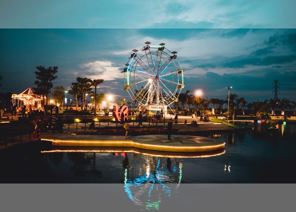
Now that you know what the dimensions of your next social media image will need to be, our second rule is a surefire way to ensure that you wind up with purposefully and beautifully composed images for social media. By ‘building a buffer,’ all we mean is simply leaving yourself some extra room around the shot you want in order to be able to crop it to the dimensions that you need. Sometimes this cropping can be minor, just altering the dimensions slightly, from, say, a 3:2 ratio to a 16:9 ratio, but other times it can be more substantial. When images for Instagram or Twitter need to be 1:1 or 2:1, respectively, you’ll be quite glad that you didn’t make the image exactly as you wanted it to look in camera, because you’ll wind up losing a significant portion of it when you’re forced to crop to these platform specific dimensions.
3rd Rule: Rule of Thirds
You’ve probably already heard of this third rule, but it’s worth examining again with social media images specifically in mind. The age-old rule of thirds – in which an image’s primary subjects fall along the intersections of lines dividing the image into thirds, both from top to bottom and left to right – can be applied to aesthetics almost universally, but it has a particular value for images created solely for social media. Often times, (and much to our chagrin), we’re asked to add logos, graphics, or overlaid text to images for social media posts. While we don’t necessarily endorse this as a best practice, we do understand the occasional need for these and other additional elements. Keeping the subject of your image to a top/bottom third or a left/right third is a good strategy to employ, not only for the fundamental compositional strengths it offers your image, but also because it creates perfect juxtaposition in your image to counterbalance any of these extra elements.
Landscape or Portrait?
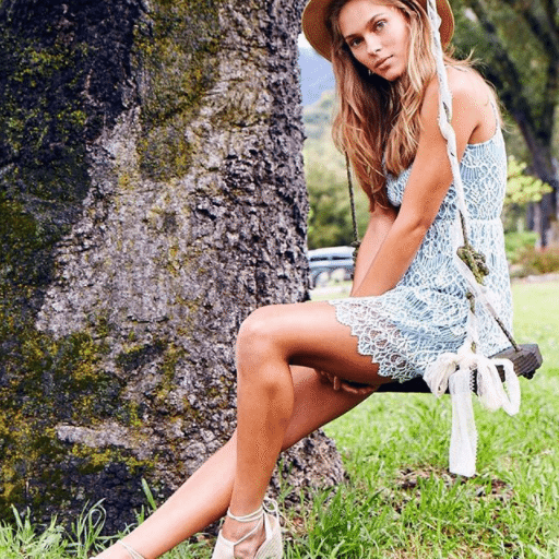
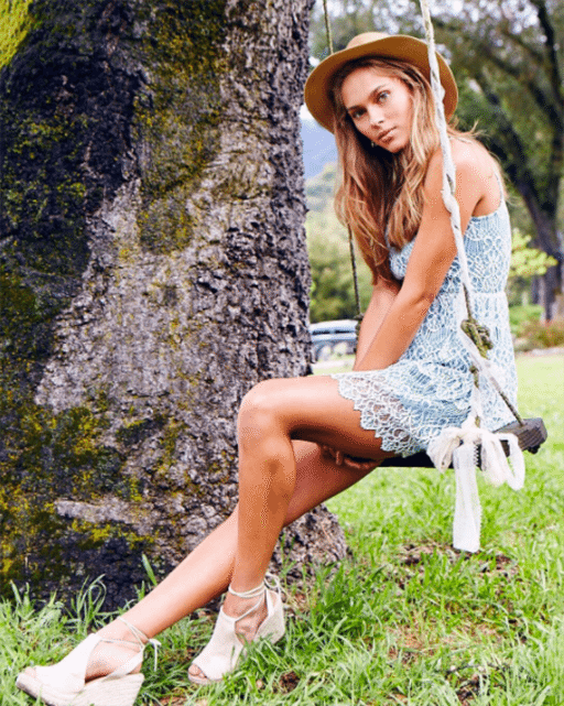
Ah, the social media content creator’s greatest dilemma: to shoot landscape or to shoot portrait, that is the question! Well, fortunately for you, we have a pretty simple and straightforward answer. For most all social-media-destined images, landscape will be the preferred choice. Facebook’s recommended image dimensions for most post types is a 1.91:1 ratio and Twitter’s is 2:1, meaning that these two major social media channels cater almost exclusively to the horizontal frame. Having said that, there are, of course, exceptions to this rule, and the obvious one is Instagram. Whether you go with the traditional 1:1 ratio of Instagram’s famed square image format, or you’re opting for 4:5 ratio of the newer portrait, or vertical, option, this is one of your perfect opportunities to turn that phone or camera on its side and make those images tall!
Let Loose & Go Crazy!
Finally, now that you’ve absorbed and digested these compositional considerations, throw them to the wayside and follow your creative instincts! Center your subject, shoot at a Dutch angle, allow your subject to bleed off the frame, and just let your imagination run wild. Do all of this and so much more, but only do so with intent. They say that you must know the rules before you can break them, and these rules for creating best in class image composition for social media are no exception. The most important part of creating innovative social media content is to be always on the lookout for ways to shake up and disrupt the norms. Now, get out there and create!


